City of Boston
In 2016, the City of Boston partnered with IDEO to launch a redesigned website that provides citizen-centric experience to millions of users.
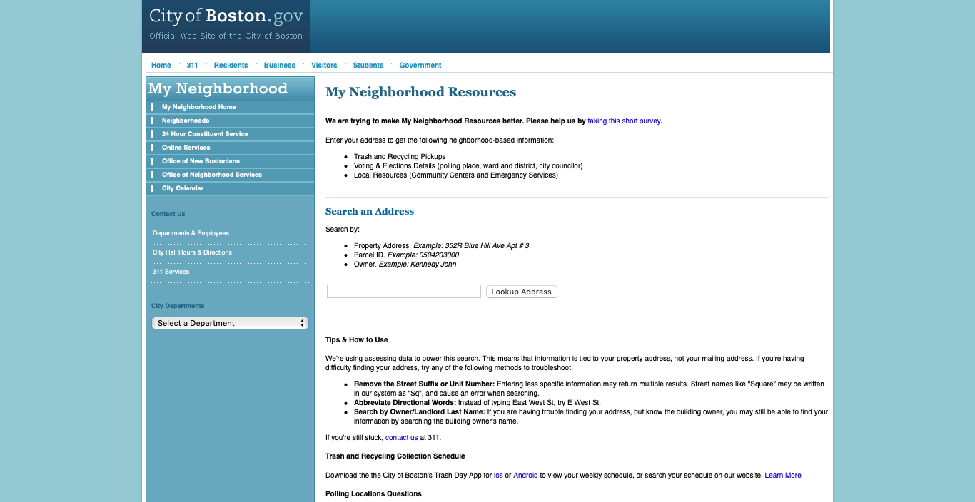
Since then, the City’s Dept. of Innovation and Technology team has been migrating services from the obsolete website (cityfboston.gov) to its new digital home (bostn.gov). One of them is My Neighborhood, a location based search service for city resources and information.
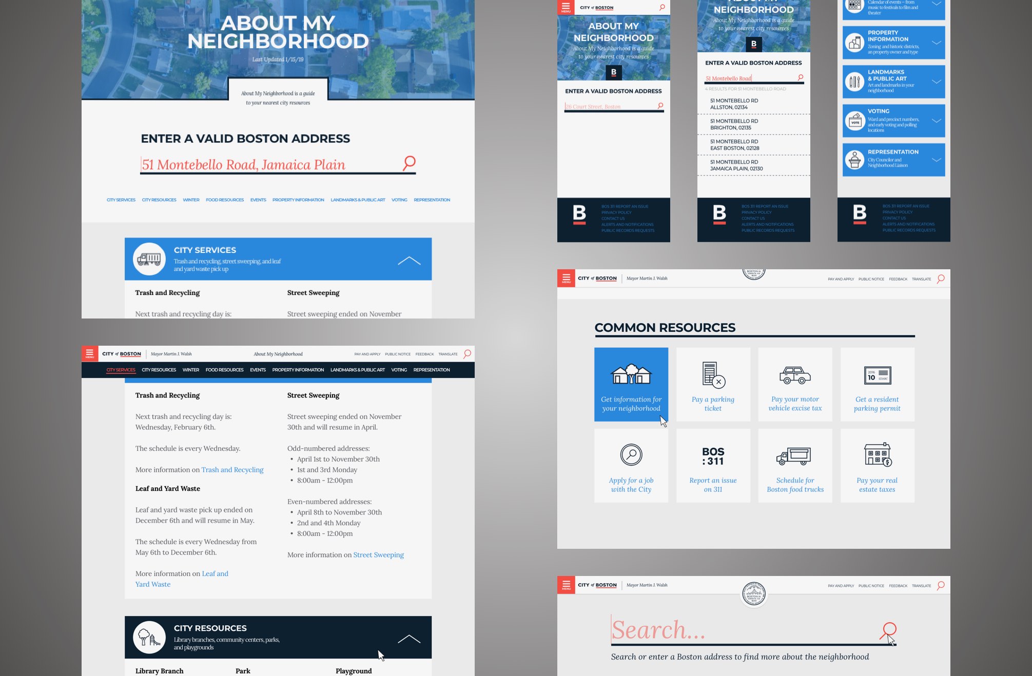
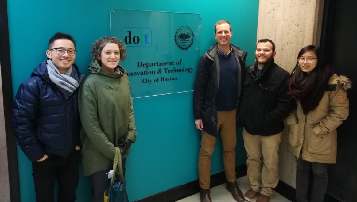
In this 3-week sprint, I worked with a product manager, a web developer and three designers to redesign My Neighborhood and integrate it into boston.gov.
The Kickoff
After the kickoff meeting, we established 3 high level goals for this project:
- Clarity ‐ the information should be structured and presented in a sensible way.
- Consistency ‐ the design should speak the same language as the rest of the website.
- Accessibility ‐ the site should be equally accessible for all types of usres.
We took advantage of the branding and style guidelines created by IDEO and jumpstarted our project quickly.
Because it is impractical to define our users based on demographics, we shifted our focus to user behaviors. While more than 40% of people browsed boston.gov on smartphones in February 2019 (source from Google Analytics), it was obvious to design for mobile screens first.
A Tale of A/B Test
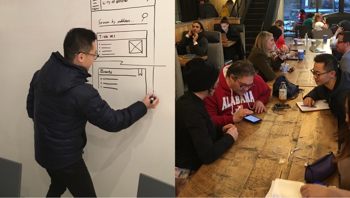
After a half day of group ideation, we narrowed down to two layouts, a static layout and an accordion layout, and then A/B tested them with 4 participants.
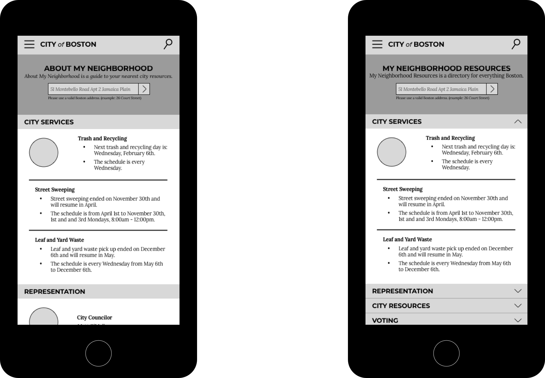
All 4 participants expressed preference over the accordion layout. The problems with the static layout were too much scrolling and information overload.
Gauge the Expectation
The datasets from the City were grouped into 9 categories, and how to present them was our next challenge.
In a separate research, we asked 34 participants to rank the 9 categories based on their interest. The ranking was to be used on a default result page.
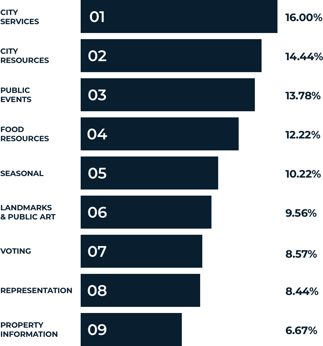
Some insights we pulled out of the research are:
- Trash collection is the most talked topic among participants.
- The Voting category becomes most relevant in election seasons.
- Though the default result page is good for the majority, people only care about information that caters to them. (An HTTP cookie can be used to dynamically organize the information.)
Optimize Search Flow
One key element on the My Neighborhood page is the search. The City of Boston uses GIS to store street addresses.
We wanted to make the search act like a courteous human, who escorts users to type in valid search prompts, makes proper predictions, and returns a clear error message if something is wrong.
To retrieve a result, a search prompt must meet 3 requirements:
- No invalid characters
- An address that matches with one in the City’s database
- A parseable and machine-readable structure

With a clear understanding on prompt requirements, we moved onto designing the user interface.
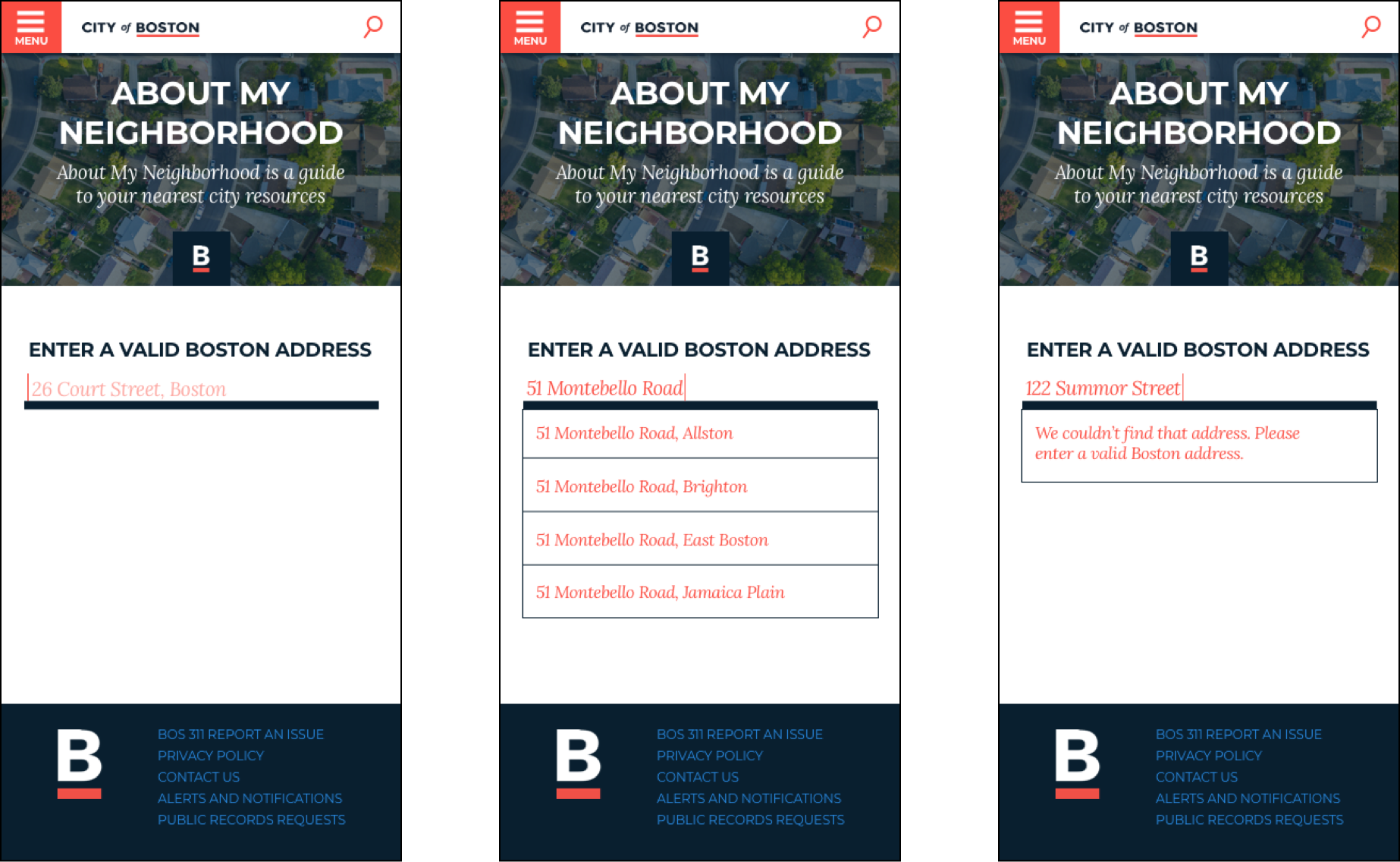
The initial concept utilized an autocomplete function, which turned out to be infeasible due to technology constraints. Having this new discovery, we forked our design using similar search flow on BOS:311. Despite one extra click, the experience was quite smooth.
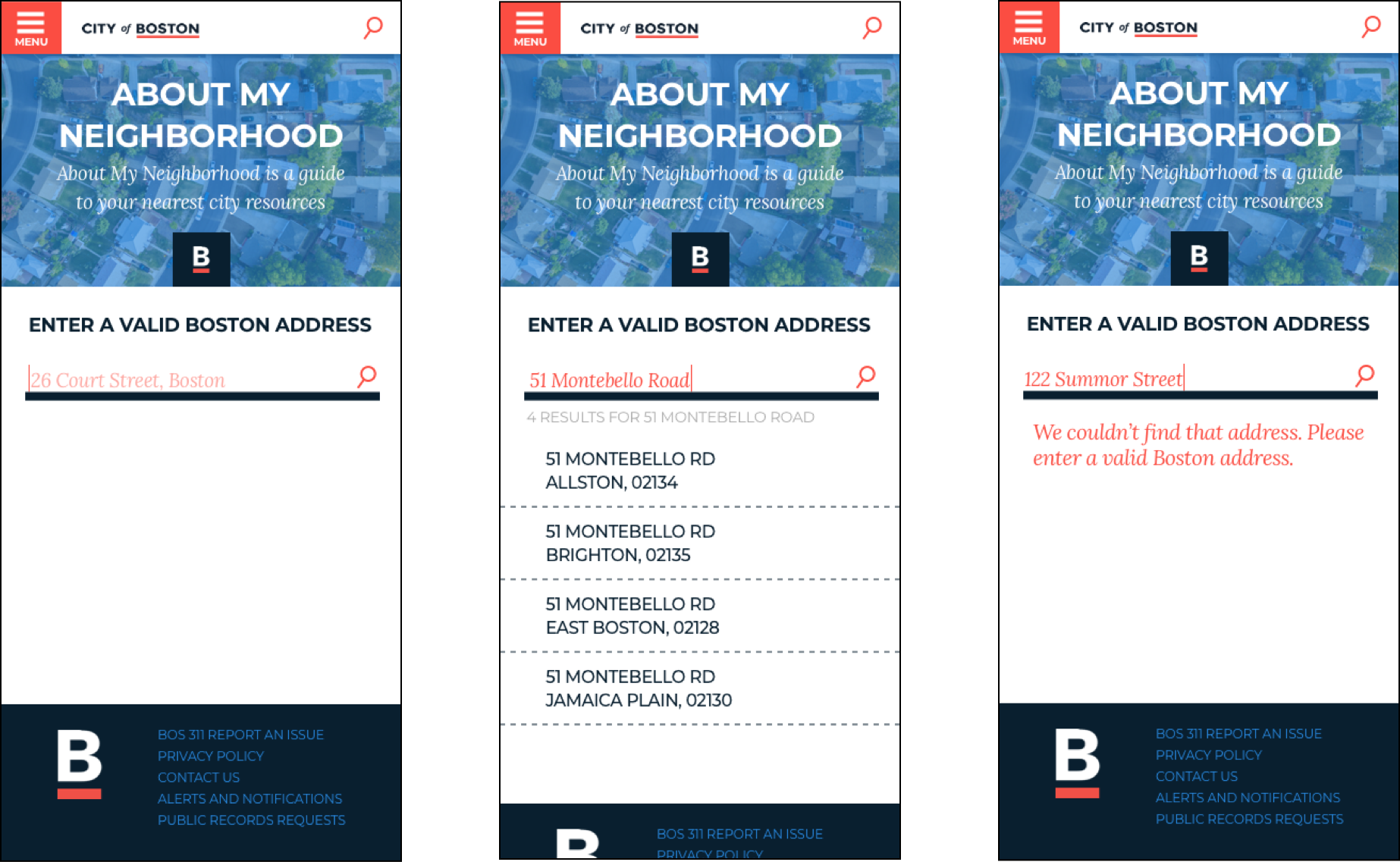
Start Small To Go Big
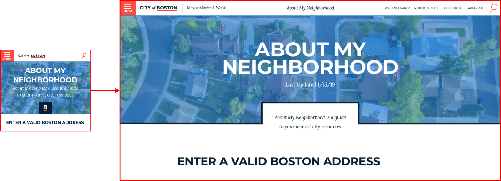
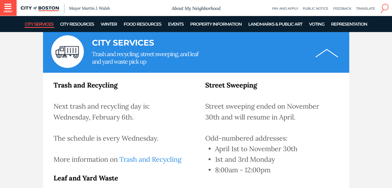
“Sketch, test and iterate” was the major theme in our entire process. After 6 rounds of iterations on the mobile, we felt ready and confident to scale up the design for desktop users.
For the limited time, we only defined two breakpoints for the responsive layout (mobile at 375px and desktop at 1440px.)

Sprint Finale
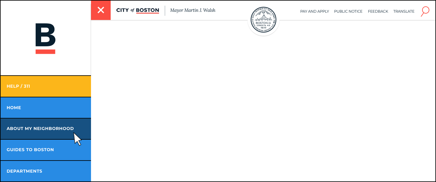
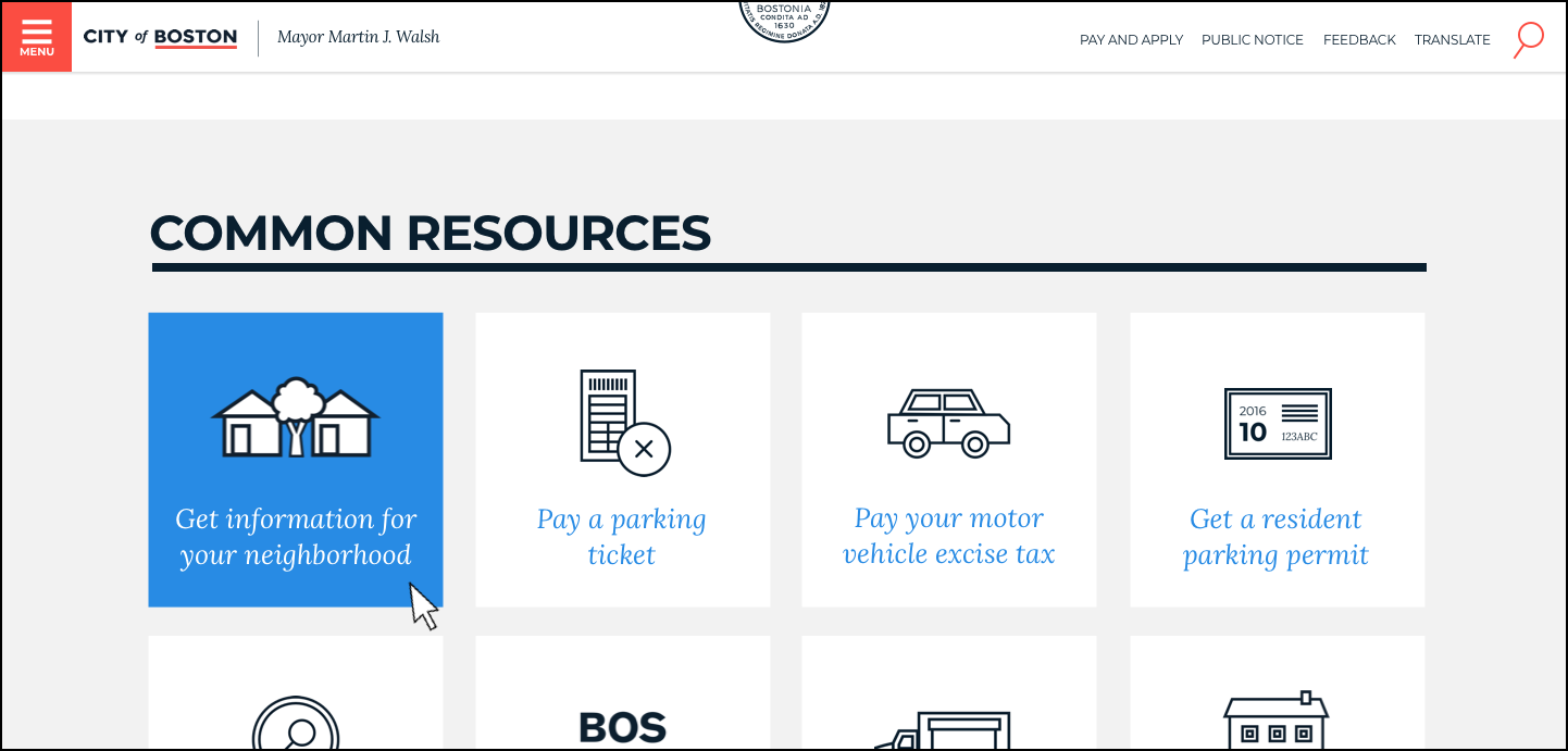
The final part of the project involves integrating the My Neighborhood page in style that is non-intrusive, but still visible.
On the boston.gov homepage, we proposed 3 options:
- Global search field
- Global side navigation bar
- Common resources section
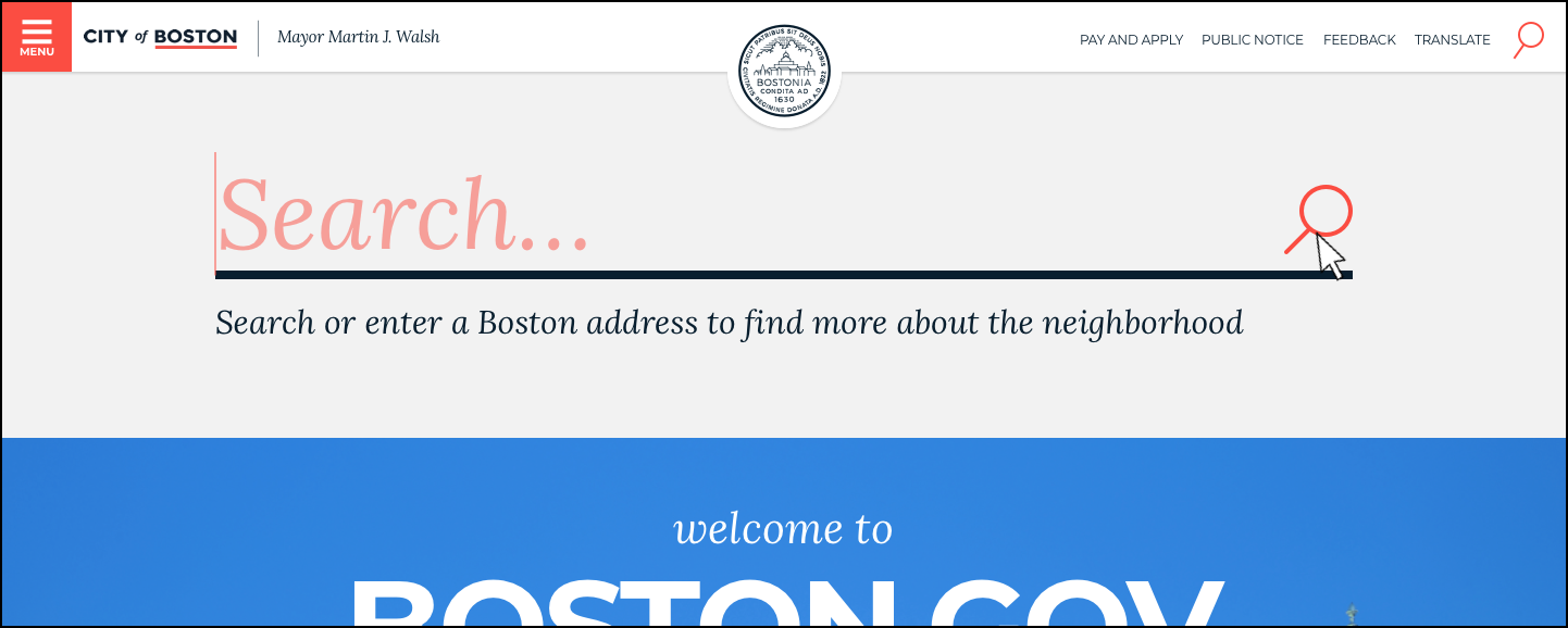
Users like the tool, and find it useful and self-explainatory.
—
Outcomes
The redesigned My Neighborhood experience is now live on the city website.
There are three main takeaways from this project.
Think of all the visible and invisible stakeholders. Their concern can influence the design enormously.
User experience is not just about design, but also the technology.
The most valuable insights actually do not grow from the intended questions.
As for the next step, I want to understand user behaviors on the site by conducting quantitative and qualitative research. Having better insights, I could finetune My Neighborhood's integration with boston.gov to provide more streamlined experiences.
